Components
Popover
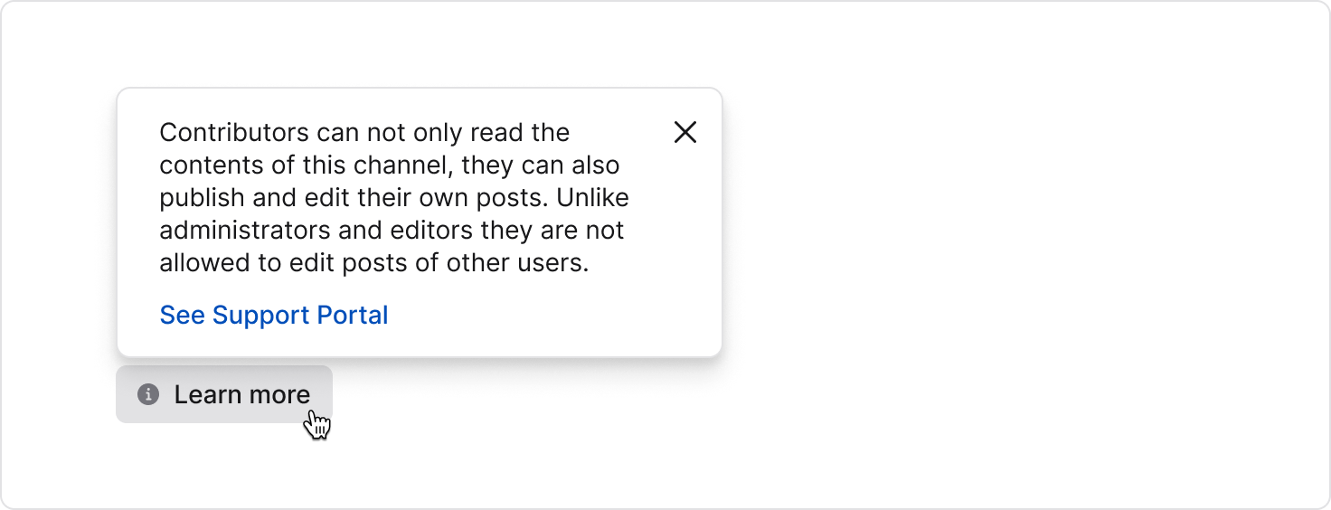
Popovers display floating content anchored to a trigger element. Use them for non-modal contextual information or actions.
Stable
GitHubAnatomy
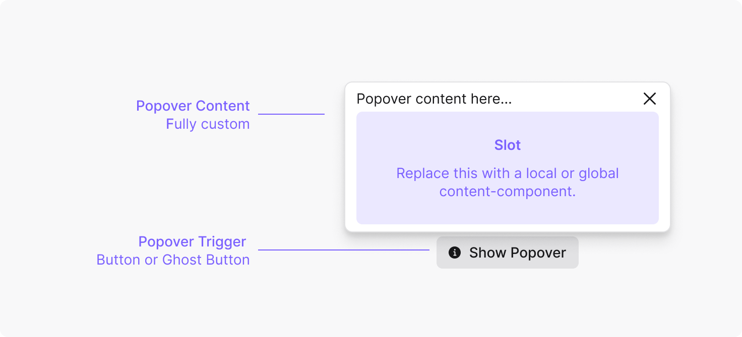
Anatomy
import {Popover} from '@staffbase/spark';

<Popover.Root>
  <Popover.Trigger />
  <Popover.Content>
    <Popover.Close />
  </Popover.Content>
</Popover.Root>;
Examples
Anchor
API reference
Root
Inherits props fromBase UI Popover Root
Trigger
Inherits props fromBase UI Popover Trigger
| Name | Type | Description |
|---|---|---|
children | ReactNode | Must be a button element. |
Content
Inherits props fromBase UI Popover Positioner
| Name | Type | Description |
|---|---|---|
children | ReactNode | The content shown inside the popover. |
anchor | ElementRefObject<Element>() => Element | An external element to position the popover against. When set, the popover is anchored to this element instead of the trigger. |
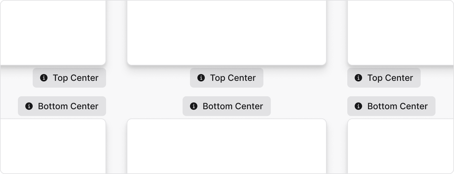
side | toprightbottomleft | Which side of the trigger (or anchor) to position the popover against. Default: bottom |
align | startcenterend | The alignment of the popover against the trigger (or anchor). Default: center |
sideOffset | number | The distance in pixels between the popover and its anchor. Also accepts a function receiving anchor and positioner dimensions for dynamic offsets. Default: 4 |
container | HTMLElementRefObject<HTMLElement> | The element the popover portal renders into. Use this instead of z-index to control stacking. Defaults to the document body. |
Close
Inherits props fromBase UI Popover Close
Anatomy
Properties
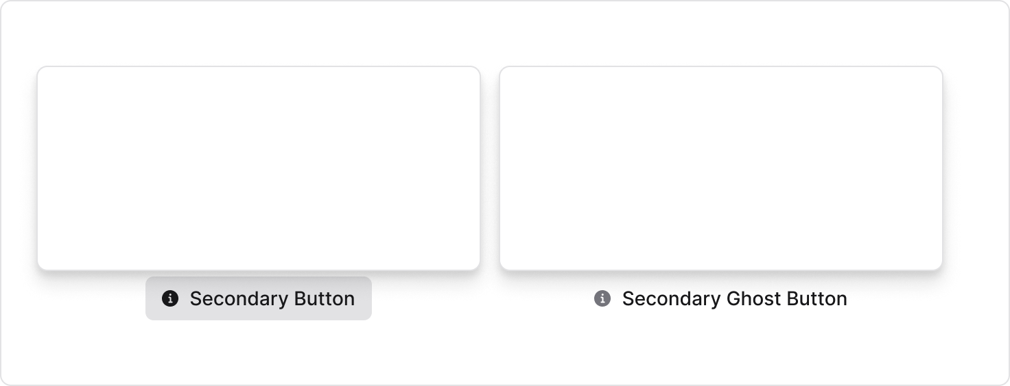
Trigger Element
Position
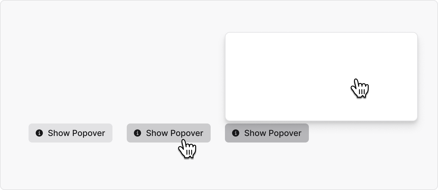
Behaviour
Interaction
Best Practices
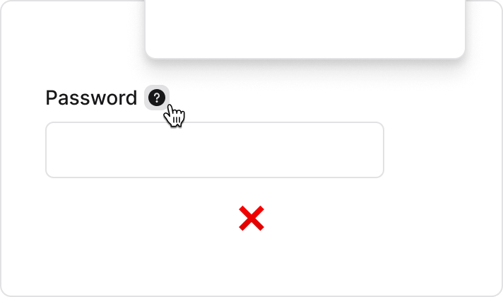
Don’t use Popover when not necessary. Hiding content can be counterproductive and there are accessible alternatives.
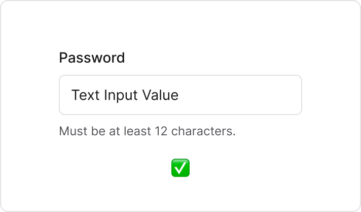
Do: Show content as description text. It improves clarity and is easier to navigate for assistive technology.
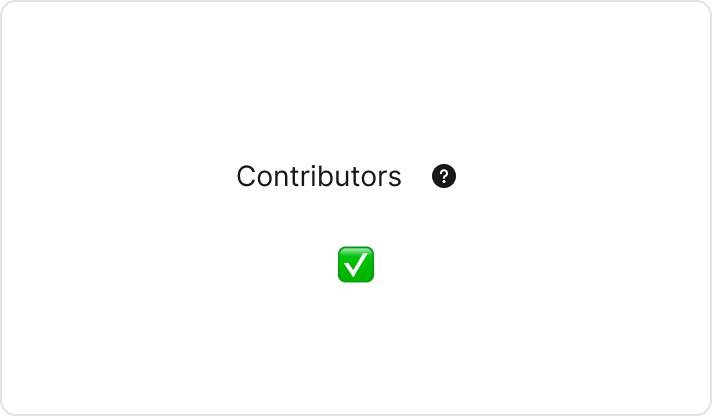
Match button height with line-height. Align the help button to the text baseline for visual balance.
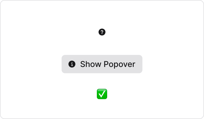
Use icons consistently. Icon-only help uses question mark, while icon plus text uses info icon.
Usage Examples
Help Button
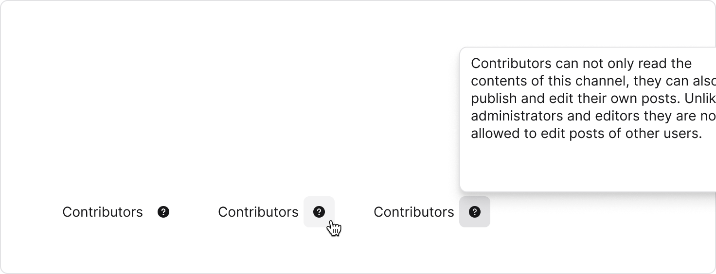
Custom Content